.avif)
Perception
Identity
Soul
.svg)
Seeking a shift from commodity to connection
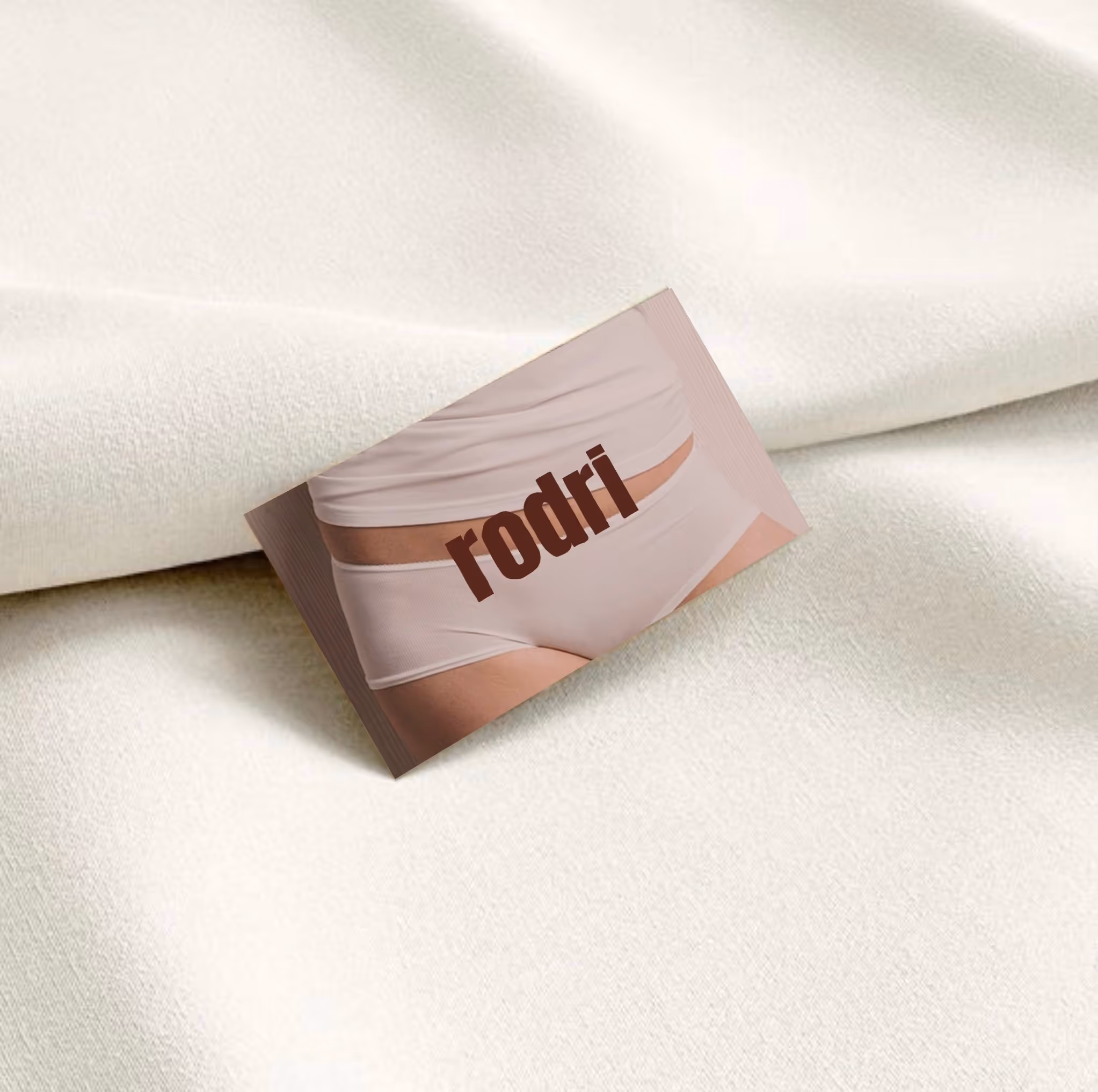
Brand identity development for a new kind of lingerie.
Rodri came to us with a fresh views on intimacy. The challenge was to break away from lingerie designed for the male gaze, and instead build a brand embedded in everyday comfort, seeing lingerie as a second skin, made for women themselves.
Our work set out to disrupt the overly polished aesthetic that dominates the category. From the start, the logo reflected this approach: with bold, imperfect strokes that mimics the natural lines of the human body. The icon, composed of two soft circles, was designed as a abstract nod to the female form.

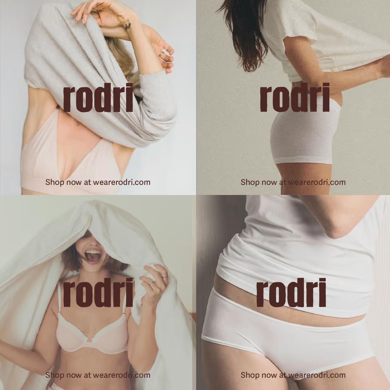
The visual world was carried through every touch point, the campaigns featured real women in their own spaces with hair undone, skin bare, unposed. The tone was playful and candid, turning away from staged seduction towards authenticity which resulted is a lingerie brand that feels direct, and lived-in. Rodri expresses femininity in it’s everyday beauty.