
Aiku handrolls
The Fastest Growing Food Culture in the World Was Never About Food.
When I first met Faisal, Hamza, Omar, and Ibrahim, the four cousins behind Aiku, the discovery meeting felt different from the conversations I was used to having.
After working across the GCC for several years, I've become familiar with the rhythm of the region's business culture. Things move quickly. Decisions move quickly. Concepts move quickly. Most conversations revolve around execution: what already exists, what is performing well elsewhere, and how quickly it can be brought to market.
This conversation was different.
There was no existing restaurant. No established concept. Instead, we spent hours discussing what was missing. At the time, Saudi Arabia's dining scene was expanding at a remarkable pace. New openings seemed to appear every week. Yet despite the growth, the four cousins shared the same observation: people weren't simply looking for food anymore. A new cultural curiosity was taking shape across the Kingdom. People were travelling more, discovering new cuisines, new formats, and new ways of experiencing food. The appetite wasn't simply for restaurants, but for concepts that felt genuinely new.
That observation became the starting point for Aiku.
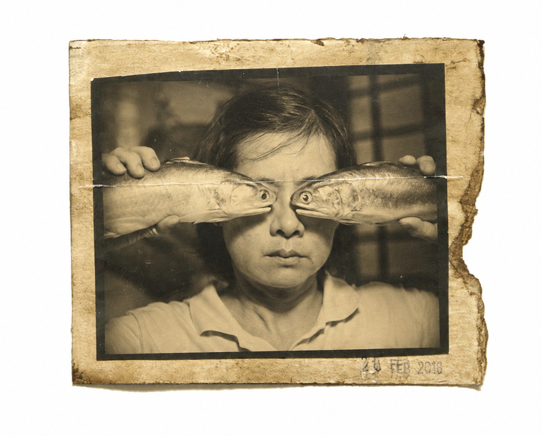
As Saudi Arabia's first dedicated handroll bar, the concept introduced an entirely different way of dining. Unlike traditional sushi restaurants built around extensive menus and lengthy meals, handroll culture revolves around immediacy. A handroll is one of the few foods built around a disappearing moment. The seaweed begins changing the second it meets the rice. Texture starts disappearing. Contrast softens. Something designed to exist at its peak for only a brief moment slowly becomes something else.
That sense of immediacy became the foundation of the brand, the naming process followed the same principle. In a market driven by recommendation and word-of-mouth, we needed a name that could travel easily. Something short, memorable, and intuitive to pronounce across the GCC. A name people could hear once, remember instantly, and repeat naturally. Aiku emerged.
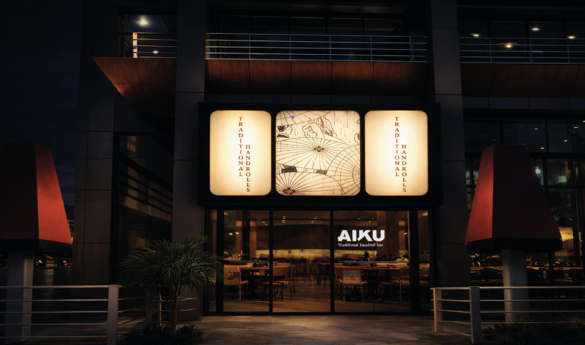
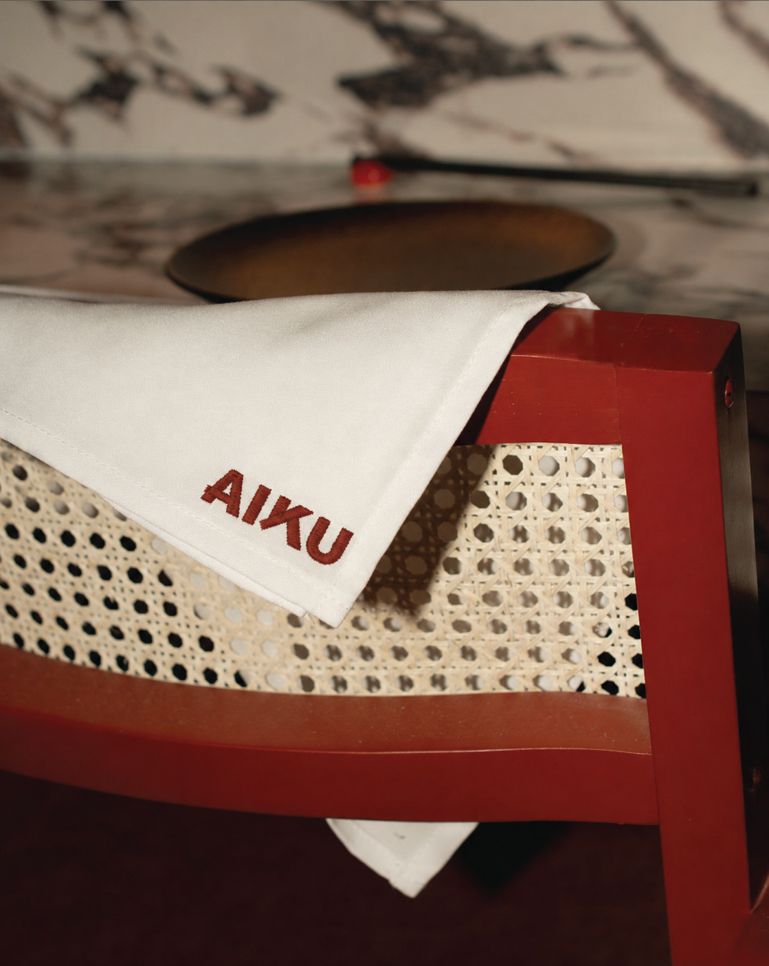
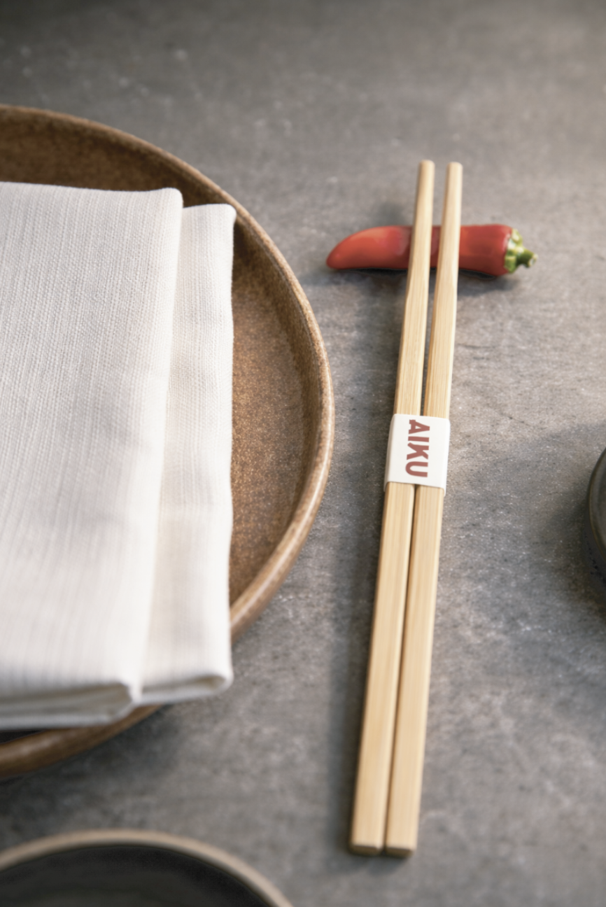
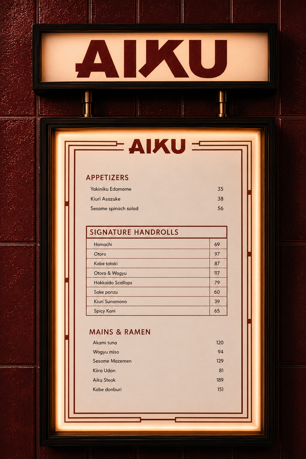
The visual identity was developed around a similar balance. Rather than relying on the visual clichés often associated with Japanese restaurants, we studied the graphic principles behind traditional Japanese design and reinterpreted them through a more contemporary lens. The logotype combines the precision and restraint commonly found in Japanese visual culture with a softer, more accessible character. The elongated strokes of the "A" and "K" introduce movement and familiarity, creating a mark that feels both rooted in Japanese influence and comfortable within a global dining landscape.
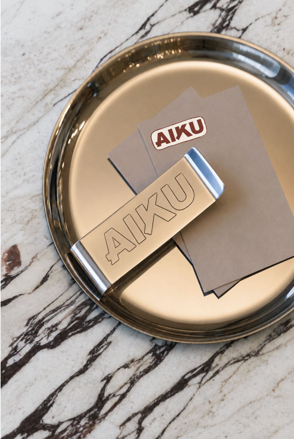
Product quality was equally important to communicate. As a concept built around fresh seafood and craftsmanship, we developed a graphic language that could reinforce those cues throughout the brand experience. The fish icon became a central asset within the system, acting as a subtle reminder of provenance, freshness, and ingredient quality.
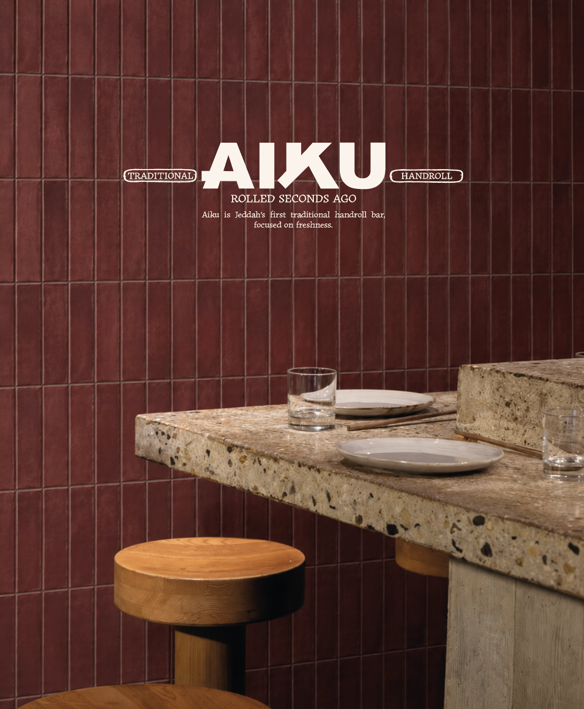
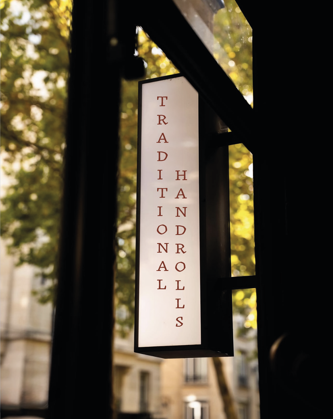
These elements were then extended across the entire brand ecosystem. From packaging and menus to signage, uniforms, and environmental graphics, every touchpoint was designed to reflect the same positioning: contemporary, memorable, and premium. The result was a brand that introduced a new dining ritual to Saudi Arabia while maintaining the level of refinement expected from a high-end hospitality concept.