

Bare organic tan
The Brand That Traveled the World While I Was Stuck at Home.
I stumbled across Bare Organic Tan in 2020, when I was stuck in my tiny Parisian apartment during lockdown. I discovered it through influencers I followed, faces glowing on my screen, skin kissed by sun I hadn’t seen in months. I felt so envious with my pale skin. I ordered it from California and waited… Impatiently. It crossed borders, warehouses, delays.
It traveled more than I did that year.
When it finally arrived, I applied it once and understood immediately. My skin looked alive again, like I had just come back from vacation instead of months of isolation. It felt like holding gold in my hands, it was liquid sunlight in drops.
And then I looked at the bottle.
And I thought “If I had seen it on a shelf, I would never have picked it up.”
The contrast was jarring. The bottle itself felt generic, easily mistaken for medication. The result however were exceptional, unlike anything I had used before. The brand… it looked clinical. Pharmacy-coded. A neutral, forgettable logotype, the kind you scroll past without registering. A sterile blue that screamed the visual language of hospitals and lab reports, exactly what I was trying to escape after months of masks, covid tests, and hospital news.
At the time, I was still in design school, studying global design, not branding. But I had time. Too much of it. I opened the tools I knew and started redesigning instinctively. What would this product look like if the brand finally reflected the emotion I felt when I used it?
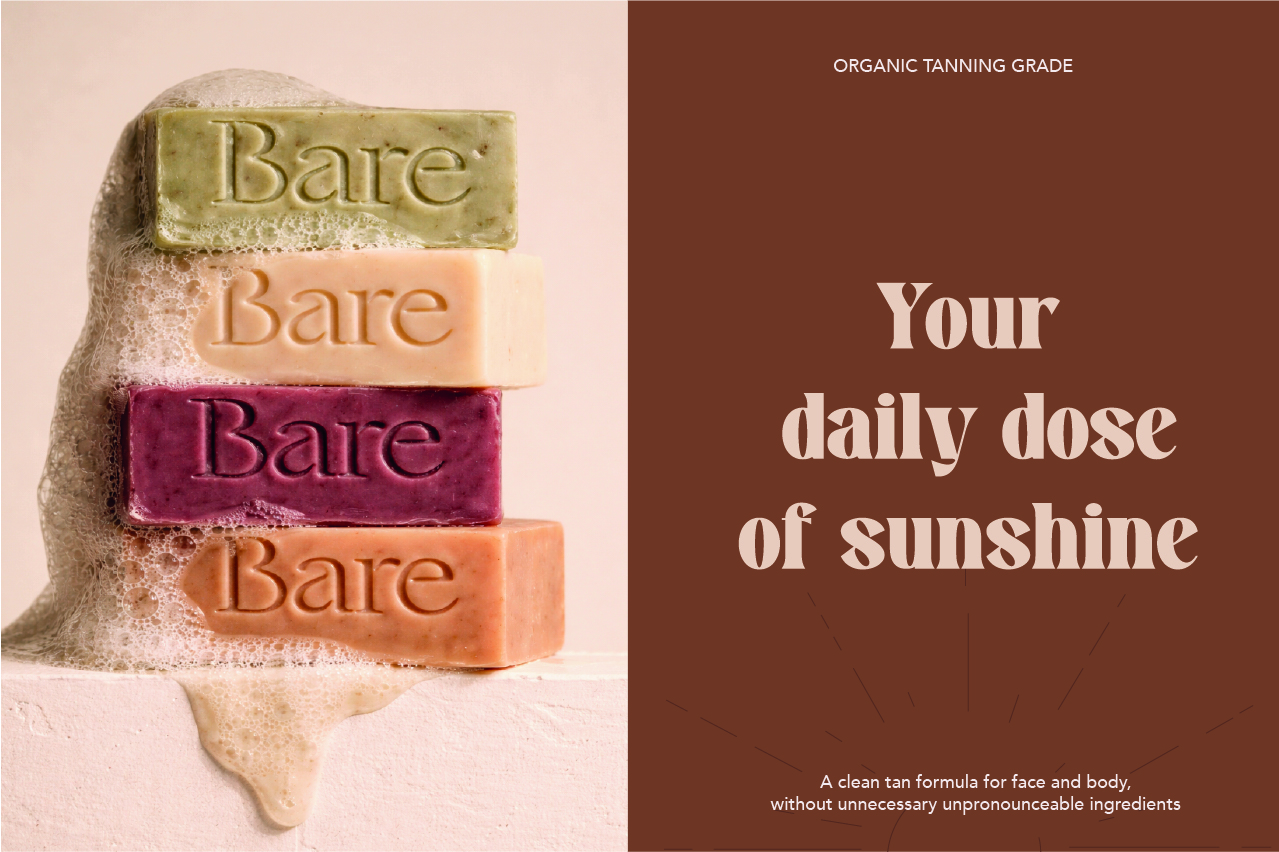
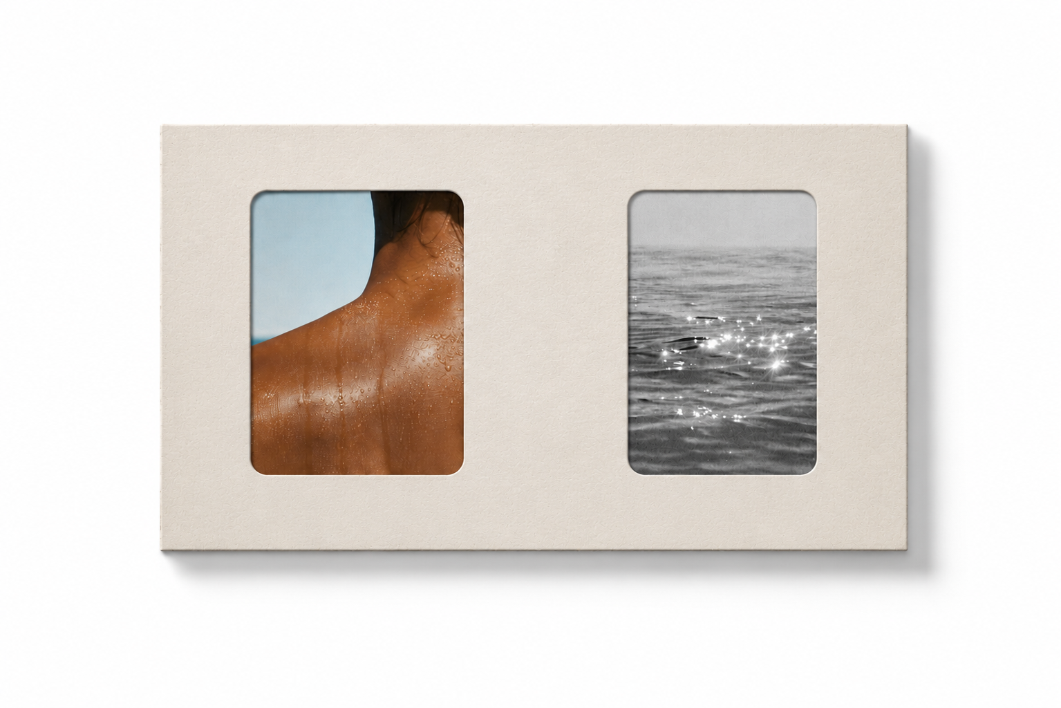
I rebuilt Bare Organic Tan from the inside out, starting with perception. The identity needed to carry the warmth, confidence, and ease the product delivered. I redesigned the logotype with softer, curved strokes, forms that reflected the woman’s curve. The icon became a sun, a straightforward sign of everything I was missing and craving back then. The color palette moved away from sterile blue toward a chromatic system drawn from thetanning ecosystem itself: sun, sand, and sea. Chosen to signal well-being and pleasure at first glance. It was a shift from clinical neutrality to experiential coherence.
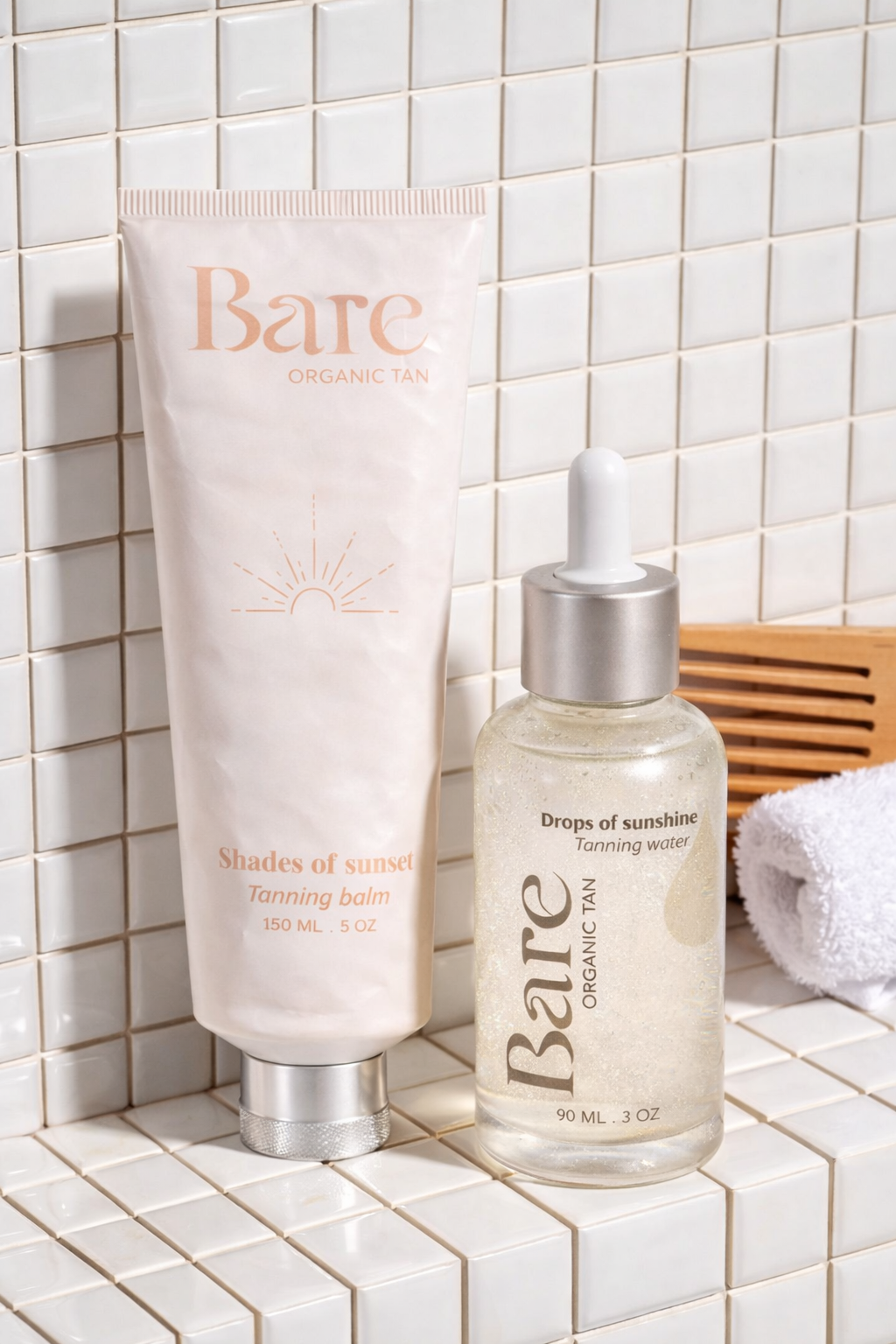
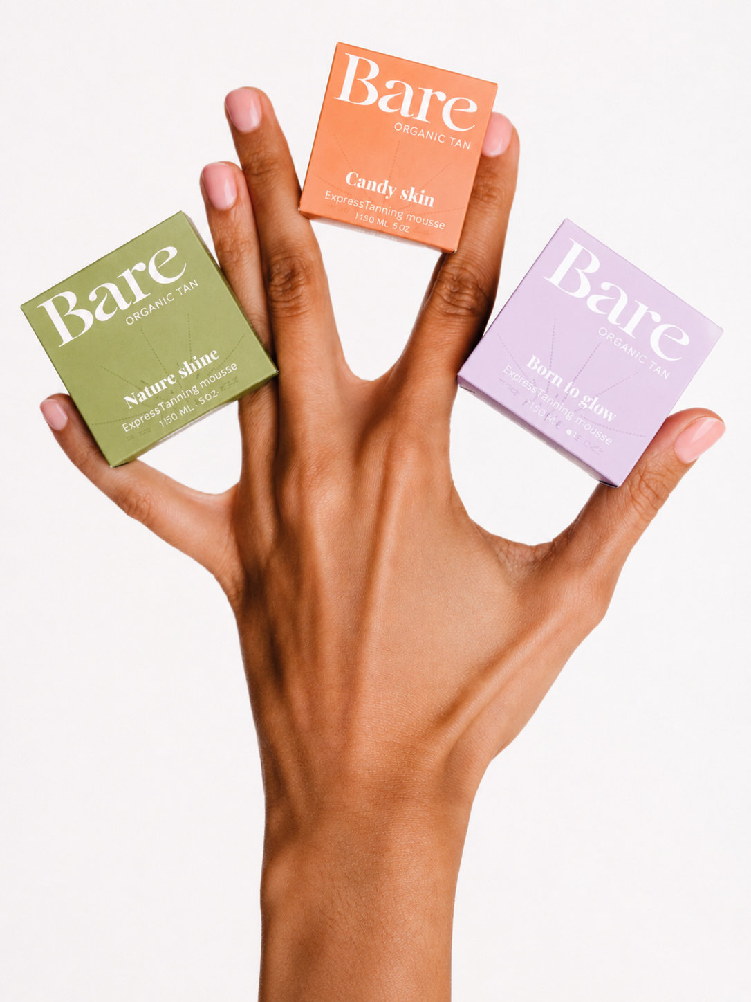
Copy followed the same logic. Technical language gave way to words rooted in use and feeling: Sunshine Glow. Golden Drops. Language that mirrors the moment of application…the sensation, the result, rather than the chemistry behind it.
When the rebrand was finished, I felt an urge to show it. So I reached out to Alex, the founder of Bare Organic Tan. Little did I know it would become a friendship stretched across oceans and the beginning of my career in branding.
.png)
When the rebrand was applied, the impact was immediate. With no change to the formula, there brand reframed the product’s value proposition and repositioned it within its category. Sales doubled. Website traffic increased by 73%. It translated directly into commercial performance, proving how perception, when aligned, converts.
That bottle crossed oceans while I was stuck in my apartment. I came out of lockdown with tanned skin, the start of my professional career, and a reason to visit California!